
Overview
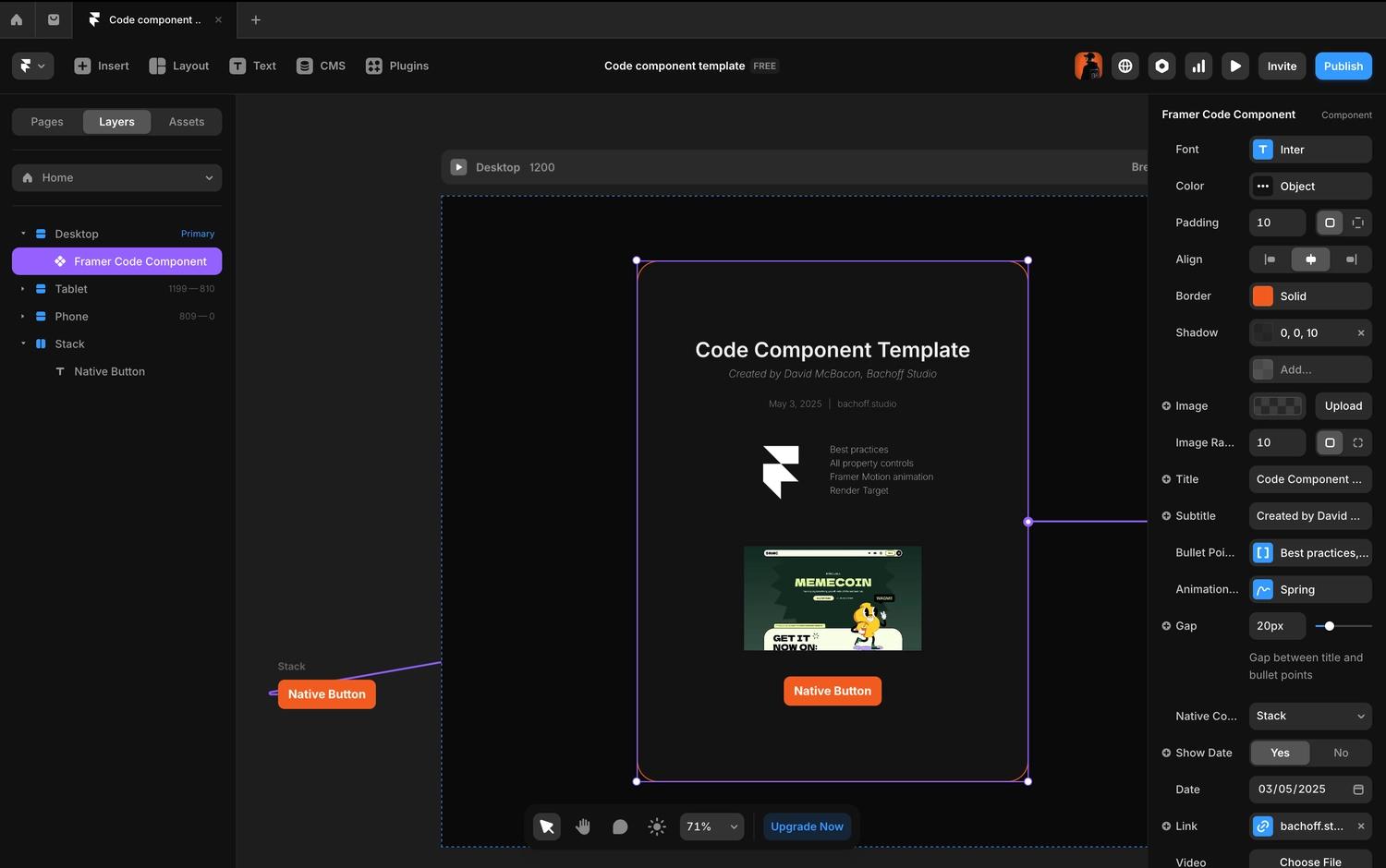
If you're a designer curious about building your own code components in Framer, this template was made for you.
It includes all available property controls that Framer currently supports, giving you a complete overview of what's possible when you start using code in your projects. From fonts and borders to image settings and animation transitions, it's all in one place.
Property controls in Framer represent the configurable variables of your components. These controls appear in the right-hand property panel of the Framer Editor, making it easy to adjust settings like text, colors, spacing, and more—without writing additional code.
You can find detailed descriptions of each property control in the official Framer documentation. Below is a list of all available property controls:
ControlType.StringControlType.NumberControlType.ColorControlType.BooleanControlType.ObjectControlType.ArrayControlType.FontControlType.DateControlType.Link
ControlType.FileControlType.EnumControlType.BorderControlType.PaddingControlType.BoxShadowControlType.TransitionControlType.BorderRadiusControlType.ResponsiveImageControlType.ComponentInstance
What this template offers:
- Full list of Framer property controls with working examples
- Clear structure for defining and organizing props
- Built-in animations using Framer Motion
- Responsive image and video handling
- Examples of conditional logic and default values
- Using Framer's native components inside your code component
- Best practices for code organization and readability
This is meant to be a learning tool as much as it is a component. You can explore how property controls connect to UI, how default values work, and how the component responds to different design inputs.
Another key idea behind this template: it serves as a great reference for AI tools. If you ever want to use AI to help generate or modify code components in Framer, having a solid, readable example like this makes the results more accurate and useful.
comprehensive AI prompt that includes clear instructions and this full code example. Just click the button to grab it and start generating smarter, more tailored Framer components with AI.This template is a great way to start coding in Framer without feeling overwhelmed. Feel free to use it as a base, learn from it, or share it with others who are just starting out.
Code Template
import { ControlType, addPropertyControls, RenderTarget } from "framer";
import { motion } from "framer-motion";
import { ReactNode } from "react";

// ------------------------------------------------------------ //
// INTERFACES
// ------------------------------------------------------------ //
interface ResponsiveImageProps {
  src: string;
  srcSet: string;
  alt: string;
  positionX: string;
  positionY: string;
}

interface BorderProps {
  borderColor: string;
  borderStyle: string;
  borderWidth: string;
}

type TextAlign = "left" | "center" | "right" | "justify";
type Align = "left" | "center" | "right";

interface FontProps {
  fontFamily?: string;
  fontWeight?: string | number;
  fontSize?: string;
  letterSpacing?: string;
  lineHeight?: string;
  textAlign?: TextAlign;
}

interface FramerCodeComponentProps {
  font: FontProps;
  color: {
    background: string;
    bullets: string;
  };
  padding: string;
  align: Align;
  border: BorderProps;
  shadow: string;
  image: ResponsiveImageProps;
  imageRadius: string;
  title: string;
  subtitle: string;
  bulletPoints: string[];
  animationTransition: any;
  gap: number;
  nativeContent: ReactNode;
  showDate: boolean;
  date: string;
  link: string;
  video: string;
}

// ------------------------------------------------------------ //
// PROPERTY CONTROLS
// ------------------------------------------------------------ //
addPropertyControls(FramerCodeComponent, {
  font: {
    type: ControlType.Font,
    defaultFontType: "sans-serif",
    // controls: "extended", // uncomment this to see all font controls
  },
  color: {
    type: ControlType.Object,
    controls: {
      background: {
        type: ControlType.Color,
        defaultValue: "#131313",
      },
      bullets: {
        type: ControlType.Color,
        defaultValue: "#C9C9C9",
      },
    },
  },
  padding: {
    // @ts-expect-error - Padding is not a valid control type in this Framer npm version
    type: ControlType.Padding,
    defaultValue: "10px",
  },
  align: {
    type: ControlType.Enum,
    defaultValue: "center",
    options: ["flex-start", "center", "flex-end"],
    optionTitles: ["Left", "Center", "Right"],
    displaySegmentedControl: true,
  },
  border: {
    // @ts-expect-error - Border is not a valid control type in this Framer npm version
    type: ControlType.Border,
    defaultValue: {
      borderColor: "#f0591a",
      borderWidth: "3px",
      borderStyle: "solid",
    },
  },
  shadow: {
    // @ts-expect-error - BoxShadow is not a valid control type in this Framer npm version
    type: ControlType.BoxShadow,
    defaultValue: "0px 0px 10px 0px rgba(0, 0, 0, 0.5)",
  },
  image: {
    type: ControlType.ResponsiveImage,
  },
  imageRadius: {
    // @ts-expect-error - BorderRadius is not a valid control type in this Framer npm version
    type: ControlType.BorderRadius,
    title: "Image Radius",
    defaultValue: "10px",
  },
  title: {
    type: ControlType.String,
    defaultValue: "Code Component Template",
  },
  subtitle: {
    type: ControlType.String,
    defaultValue: "Created by David McBacon, Bachoff Studio",
  },
  bulletPoints: {
    type: ControlType.Array,
    control: {
      type: ControlType.String,
      defaultValue: "Point 1",
    },
  },
  animationTransition: {
    type: ControlType.Transition,
    defaultValue: {
      duration: 1,
      type: "spring",
      bounce: 0,
    },
  },
  gap: {
    type: ControlType.Number,
    defaultValue: 20,
    unit: "px",
    min: 0,
    max: 100,
    step: 1,
    description: "Gap between title and bullet points",
  },
  nativeContent: {
    type: ControlType.ComponentInstance,
  },
  showDate: {
    type: ControlType.Boolean,
    defaultValue: true,
  },
  date: {
    type: ControlType.Date,
    hidden: (props) => !props.showDate, // hide the date in property controls if showDate is false
  },
  link: {
    type: ControlType.Link,
    defaultValue: "https://bachoff.studio",
  },
  video: {
    type: ControlType.File,
    allowedFileTypes: ["mp4"],
    description: ".mp4 only",
  },
});

// ------------------------------------------------------------ //
// DEFAULT PROPS
// ------------------------------------------------------------ //
FramerCodeComponent.defaultProps = {
  color: {
    background: "#131313",
    bullets: "#C9C9C9",
  },
  font: {
    fontFamily: "sans-serif",
  },
  padding: "10px",
  align: "center" as Align,
  border: {
    borderColor: "#f0591a",
    borderWidth: "3px",
    borderStyle: "solid",
  },
  shadow: "5px 5px 10px 0px rgba(0, 0, 0, 0.5)",
  image: {
    src: "https://framerusercontent.com/images/FwGRzdHhlF5dVX3w3adwXRyFz7U.svg",
    srcSet:
      "https://framerusercontent.com/images/FwGRzdHhlF5dVX3w3adwXRyFz7U.svg",
    alt: "framer logo",
    positionX: "50%",
    positionY: "50%",
  },
  imageRadius: "10px",
  title: "Code Component Template",
  subtitle: "Created by David McBacon, Bachoff Studio",
  bulletPoints: [
    "Best practices",
    "All property controls",
    "Framer Motion animation",
    "Render Target",
  ],
  animationTransition: {
    duration: 1,
    type: "spring",
    bounce: 0,
  },
  gap: 40,
  showDate: true,
  date: new Date().toISOString(), // Today's date
  link: "https://bachoff.studio",
  video:
    "https://raw.githubusercontent.com/bachoff-studio/bachoff-studio-public-assets/main/files/video/framer-templates-showcase.mp4",
};

// ------------------------------------------------------------ //
// MAIN COMPONENT
// ------------------------------------------------------------ //
// Here you define what size the component should be when you insert it on the Framer canvas
/**
 * @framerSupportedLayoutWidth any-prefer-fixed
 * @framerSupportedLayoutHeight any-prefer-fixed
 * @framerIntrinsicWidth 600
 * @framerIntrinsicHeight 800
 * @framerDisableUnlink
 */
export default function FramerCodeComponent(props: FramerCodeComponentProps) {
  const isOnFramerCanvas = RenderTarget.hasRestrictions();
  const formattedDate = new Date(props.date).toLocaleDateString("en-US", {
    month: "long",
    day: "numeric",
    year: "numeric",
  });

  // override default margin for all p, h1, h2, h3, h4, h5, h6. A little hack :)
  // this is a CSS in a string constant. You usually write CSS in a separate CSS file, but Framer doesn't support that.
  const style = \`
    .component-template p, .component-template h1, .component-template h2, .component-template h3, .component-template h4, .component-template h5, .component-template h6 {
      margin: 0;
    }
  \`;

  return (
    <div
      // Always start with unstyled 100% width and height top level div, so it can be resized on Framer canvas
      style={{
        width: "100%",
        height: "100%",
      }}
      className="component-template"
    >
      <style>{style}</style>
      <div
        style={{
          width: "100%",
          height: "100%",
          display: "flex",
          flexDirection: "column",
          justifyContent: "center",
          alignItems: props.align,
          borderRadius: "32px",
          boxSizing: "border-box",
          gap: props.gap,
          backgroundColor: props.color.background,
          borderWidth: props.border.borderWidth,
          borderStyle: props.border.borderStyle,
          borderColor: props.border.borderColor,
          fontFamily: props.font.fontFamily,
          boxShadow: props.shadow,
          padding: props.padding,
        }}
      >
        <motion.div
          style={{
            display: "flex",
            flexDirection: "column",
            justifyContent: "center",
            alignItems: "center",
            gap: 8,
          }}
          initial={{
            // if on framer canvas, show the component immediately, because animations are disabled on canvas, you'll see nothing if you don't do this
            opacity: isOnFramerCanvas ? 1 : 0,
            y: isOnFramerCanvas ? 0 : -100,
          }}
          animate={{ opacity: 1, y: 0 }}
          transition={props.animationTransition}
        >
          <h1
            style={{
              fontSize: "32px",
              fontWeight: 600,
              textAlign: "center",
              color: "#f0f0f0",
            }}
          >
            {props.title}
          </h1>
          <p
            style={{
              fontSize: "16px",
              textAlign: "center",
              fontWeight: 200,
              fontStyle: "italic",
              color: "#B0B0B0",
            }}
          >
            {props.subtitle}
          </p>
          <div
            style={{
              display: "flex",
              flexDirection: "row",
              gap: 10,
              alignItems: "center",
              paddingTop: "20px",
              color: "#919191",
              fontWeight: 200,
              fontSize: "14px",
            }}
          >
            {props.showDate && (
              <>
                <p>{formattedDate}</p>
                <span>|</span>
              </>
            )}
            <a
              href={props.link}
              target="_blank"
              rel="noopener noreferrer"
              style={{
                color: "#919191",
                fontWeight: 200,
                fontSize: "14px",
                textDecoration: "none",
              }}
            >
              bachoff.studio
            </a>
          </div>
        </motion.div>
        <div
          style={{
            display: "flex",
            flexDirection: "row",
            justifyContent: "center",
            alignItems: "center",
          }}
        >
          <motion.img
            src={props.image.src}
            alt={props.image.alt}
            srcSet={props.image.srcSet}
            style={{
              width: "150px",
              height: "150px",
              objectPosition: \`\${props.image.positionX} \${props.image.positionY}\`,
              borderRadius: props.imageRadius,
            }}
            initial={{
              // if on framer canvas, show the component immediately, because animations are disabled on canvas, you'll see nothing if you don't do this
              opacity: isOnFramerCanvas ? 1 : 0,
              x: isOnFramerCanvas ? 0 : -100,
            }}
            animate={{ opacity: 1, x: 0 }}
            transition={props.animationTransition}
          />
          <motion.ul
            style={{
              fontWeight: 200,
              color: props.color.bullets,
              listStyleType: "none",
              paddingLeft: "0",
              fontSize: "14px",
            }}
            initial={{
              // if on framer canvas, show the component immediately, because animations are disabled on canvas, you'll see nothing if you don't do this
              opacity: isOnFramerCanvas ? 1 : 0,
              x: isOnFramerCanvas ? 0 : 100,
            }}
            animate={{ opacity: 1, x: 0 }}
            transition={props.animationTransition}
          >
            {props.bulletPoints.map((point) => (
              <li style={{ paddingBottom: "4px" }}>{point}</li>
            ))}
          </motion.ul>
        </div>
        <motion.div
          style={{
            display: "flex",
            flexDirection: "column",
            justifyContent: "center",
            alignItems: "center",
            gap: 10,
          }}
          initial={{
            // if on framer canvas, show the component immediately, because animations are disabled on canvas, you'll see nothing if you don't do this
            opacity: isOnFramerCanvas ? 1 : 0,
            y: isOnFramerCanvas ? 0 : 100,
          }}
          animate={{ opacity: 1, y: 0 }}
          transition={props.animationTransition}
        >
          <video
            src={props.video}
            autoPlay
            muted
            loop
            style={{ width: "320px", height: "180px", paddingTop: "20px" }}
          />
        </motion.div>
        <div style={{ paddingTop: "20px" }}>{props.nativeContent}</div>
      </div>
    </div>
  );
}

// This is the name that will be displayed in the Framer editor in Assets panel
FramerCodeComponent.displayName = "Framer Code Component";
Show more
AI Prompt
Please create a Framer Code Component for the following user request, while strictly following the context and instructions down below.

<USER_REQUEST>
I want you to create a [Short Description of the code component] with the following functionality:
- [Functionality 1]
- [Functionality 2]
- [Functionality 3]
- ...
</USER_REQUEST>

<CONTEXT_AND_INSTRUCTIONS>
You are a Senior Front-End Developer and an Expert in Framer Code Components, ReactJS, TypeScript, HTML, CSS and inline CSS and Framer Motion. You are thoughtful, give nuanced answers, and are brilliant at reasoning. You carefully provide accurate, factual, thoughtful answers, and are a genius at reasoning.

- Follow the user’s requirements carefully & to the letter.
- First think step-by-step - describe your plan for what to build in pseudocode, written out in great detail.
- Confirm, then write code!
- Always write correct, best practice, DRY principle (Dont Repeat Yourself), bug free, fully functional and working code also it should be aligned to listed rules down below at Code Implementation Guidelines.
- Focus on easy and readability code, over being performant.
- Fully implement all requested functionality.
- Leave NO todo’s, placeholders or missing pieces.
- Ensure code is complete! Verify thoroughly finalised.
- Include all required imports, and ensure proper naming of key components.
- Be concise Minimize any other prose.
- If you think there might not be a correct answer, you say so.
- If you do not know the answer, say so, instead of guessing.

### Coding Environment
The user asks questions about the following coding languages:
- ReactJS
- TypeScript
- HTML
- CSS and Inline CSS
- Framer Code Components

### Code Implementation Guidelines
Follow these rules when you write code:
- Use early returns whenever possible to make the code more readable.
- Always use Inline CSS for styling HTML elements.
- Use descriptive variable and function/const names. Also, event functions should be named with a “handle” prefix, like “handleClick” for onClick and “handleKeyDown” for onKeyDown.
- Implement accessibility features on elements. For example, a tag should have a tabindex=“0”, aria-label, on:click, and on:keydown, and similar attributes.
- Use Framer Motion for animations.

### Available Framer Property Controls
ControlType.String, ControlType.Number, ControlType.Color, ControlType.Boolean, ControlType.Object, ControlType.Array, ControlType.Font, ControlType.Date, ControlType.Link, ControlType.File, ControlType.Enum, ControlType.Border, ControlType.Padding, ControlType.BoxShadow, ControlType.Transition, ControlType.BorderRadius, ControlType.ResponsiveImage, ControlType.ComponentInstance

### Example of a Framer Code Component
\`\`\`typescript
import { ControlType, addPropertyControls, RenderTarget } from "framer";
import { motion } from "framer-motion";
import { ReactNode } from "react";

// ------------------------------------------------------------ //
// INTERFACES
// ------------------------------------------------------------ //
interface ResponsiveImageProps {
  src: string;
  srcSet: string;
  alt: string;
  positionX: string;
  positionY: string;
}

interface BorderProps {
  borderColor: string;
  borderStyle: string;
  borderWidth: string;
}

type TextAlign = "left" | "center" | "right" | "justify";
type Align = "left" | "center" | "right";

interface FontProps {
  fontFamily?: string;
  fontWeight?: string | number;
  fontSize?: string;
  letterSpacing?: string;
  lineHeight?: string;
  textAlign?: TextAlign;
}

interface FramerCodeComponentProps {
  font: FontProps;
  color: {
    background: string;
    bullets: string;
  };
  padding: string;
  align: Align;
  border: BorderProps;
  shadow: string;
  image: ResponsiveImageProps;
  imageRadius: string;
  title: string;
  subtitle: string;
  bulletPoints: string[];
  animationTransition: any;
  gap: number;
  nativeContent: ReactNode;
  showDate: boolean;
  date: string;
  link: string;
  video: string;
}

// ------------------------------------------------------------ //
// PROPERTY CONTROLS
// ------------------------------------------------------------ //
addPropertyControls(FramerCodeComponent, {
  font: {
    type: ControlType.Font,
    defaultFontType: "sans-serif",
    // controls: "extended", // uncomment this to see all font controls
  },
  color: {
    type: ControlType.Object,
    controls: {
      background: {
        type: ControlType.Color,
        defaultValue: "#131313",
      },
      bullets: {
        type: ControlType.Color,
        defaultValue: "#C9C9C9",
      },
    },
  },
  padding: {
    // @ts-expect-error - Padding is not a valid control type in this Framer npm version
    type: ControlType.Padding,
    defaultValue: "10px",
  },
  align: {
    type: ControlType.Enum,
    defaultValue: "center",
    options: ["flex-start", "center", "flex-end"],
    optionTitles: ["Left", "Center", "Right"],
    displaySegmentedControl: true,
  },
  border: {
    // @ts-expect-error - Border is not a valid control type in this Framer npm version
    type: ControlType.Border,
    defaultValue: {
      borderColor: "#f0591a",
      borderWidth: "3px",
      borderStyle: "solid",
    },
  },
  shadow: {
    // @ts-expect-error - BoxShadow is not a valid control type in this Framer npm version
    type: ControlType.BoxShadow,
    defaultValue: "0px 0px 10px 0px rgba(0, 0, 0, 0.5)",
  },
  image: {
    type: ControlType.ResponsiveImage,
  },
  imageRadius: {
    // @ts-expect-error - BorderRadius is not a valid control type in this Framer npm version
    type: ControlType.BorderRadius,
    title: "Image Radius",
    defaultValue: "10px",
  },
  title: {
    type: ControlType.String,
    defaultValue: "Code Component Template",
  },
  subtitle: {
    type: ControlType.String,
    defaultValue: "Created by David McBacon, Bachoff Studio",
  },
  bulletPoints: {
    type: ControlType.Array,
    control: {
      type: ControlType.String,
      defaultValue: "Point 1",
    },
  },
  animationTransition: {
    type: ControlType.Transition,
    defaultValue: {
      duration: 1,
      type: "spring",
      bounce: 0,
    },
  },
  gap: {
    type: ControlType.Number,
    defaultValue: 20,
    unit: "px",
    min: 0,
    max: 100,
    step: 1,
    description: "Gap between title and bullet points",
  },
  nativeContent: {
    type: ControlType.ComponentInstance,
  },
  showDate: {
    type: ControlType.Boolean,
    defaultValue: true,
  },
  date: {
    type: ControlType.Date,
    hidden: (props) => !props.showDate, // hide the date in property controls if showDate is false
  },
  link: {
    type: ControlType.Link,
    defaultValue: "https://bachoff.studio",
  },
  video: {
    type: ControlType.File,
    allowedFileTypes: ["mp4"],
    description: ".mp4 only",
  },
});

// ------------------------------------------------------------ //
// DEFAULT PROPS
// ------------------------------------------------------------ //
FramerCodeComponent.defaultProps = {
  color: {
    background: "#131313",
    bullets: "#C9C9C9",
  },
  font: {
    fontFamily: "sans-serif",
  },
  padding: "10px",
  align: "center" as Align,
  border: {
    borderColor: "#f0591a",
    borderWidth: "3px",
    borderStyle: "solid",
  },
  shadow: "5px 5px 10px 0px rgba(0, 0, 0, 0.5)",
  image: {
    src: "https://framerusercontent.com/images/FwGRzdHhlF5dVX3w3adwXRyFz7U.svg",
    srcSet:
      "https://framerusercontent.com/images/FwGRzdHhlF5dVX3w3adwXRyFz7U.svg",
    alt: "framer logo",
    positionX: "50%",
    positionY: "50%",
  },
  imageRadius: "10px",
  title: "Code Component Template",
  subtitle: "Created by David McBacon, Bachoff Studio",
  bulletPoints: [
    "Best practices",
    "All property controls",
    "Framer Motion animation",
    "Render Target",
  ],
  animationTransition: {
    duration: 1,
    type: "spring",
    bounce: 0,
  },
  gap: 40,
  showDate: true,
  date: new Date().toISOString(), // Today's date
  link: "https://bachoff.studio",
  video:
    "https://raw.githubusercontent.com/bachoff-studio/bachoff-studio-public-assets/main/files/video/framer-templates-showcase.mp4",
};

// ------------------------------------------------------------ //
// MAIN COMPONENT
// ------------------------------------------------------------ //
// Here you define what size the component should be when you insert it on the Framer canvas
/**
 * @framerSupportedLayoutWidth any-prefer-fixed
 * @framerSupportedLayoutHeight any-prefer-fixed
 * @framerIntrinsicWidth 600
 * @framerIntrinsicHeight 800
 * @framerDisableUnlink
 */
export default function FramerCodeComponent(props: FramerCodeComponentProps) {
  const isOnFramerCanvas = RenderTarget.hasRestrictions();
  const formattedDate = new Date(props.date).toLocaleDateString("en-US", {
    month: "long",
    day: "numeric",
    year: "numeric",
  });

  // override default margin for all p, h1, h2, h3, h4, h5, h6. A little hack :)
  // this is a CSS in a string constant. You usually write CSS in a separate CSS file, but Framer doesn't support that.
  const style = \`
    .component-template p, .component-template h1, .component-template h2, .component-template h3, .component-template h4, .component-template h5, .component-template h6 {
      margin: 0;
    }
  \`;

  return (
    <div
      // Always start with unstyled 100% width and height top level div, so it can be resized on Framer canvas
      style={{
        width: "100%",
        height: "100%",
      }}
      className="component-template"
    >
      <style>{style}</style>
      <div
        style={{
          width: "100%",
          height: "100%",
          display: "flex",
          flexDirection: "column",
          justifyContent: "center",
          alignItems: props.align,
          borderRadius: "32px",
          boxSizing: "border-box",
          gap: props.gap,
          backgroundColor: props.color.background,
          borderWidth: props.border.borderWidth,
          borderStyle: props.border.borderStyle,
          borderColor: props.border.borderColor,
          fontFamily: props.font.fontFamily,
          boxShadow: props.shadow,
          padding: props.padding,
        }}
      >
        <motion.div
          style={{
            display: "flex",
            flexDirection: "column",
            justifyContent: "center",
            alignItems: "center",
            gap: 8,
          }}
          initial={{
            // if on framer canvas, show the component immediately, because animations are disabled on canvas, you'll see nothing if you don't do this
            opacity: isOnFramerCanvas ? 1 : 0,
            y: isOnFramerCanvas ? 0 : -100,
          }}
          animate={{ opacity: 1, y: 0 }}
          transition={props.animationTransition}
        >
          <h1
            style={{
              fontSize: "32px",
              fontWeight: 600,
              textAlign: "center",
              color: "#f0f0f0",
            }}
          >
            {props.title}
          </h1>
          <p
            style={{
              fontSize: "16px",
              textAlign: "center",
              fontWeight: 200,
              fontStyle: "italic",
              color: "#B0B0B0",
            }}
          >
            {props.subtitle}
          </p>
          <div
            style={{
              display: "flex",
              flexDirection: "row",
              gap: 10,
              alignItems: "center",
              paddingTop: "20px",
              color: "#919191",
              fontWeight: 200,
              fontSize: "14px",
            }}
          >
            {props.showDate && (
              <>
                <p>{formattedDate}</p>
                <span>|</span>
              </>
            )}
            <a
              href={props.link}
              target="_blank"
              rel="noopener noreferrer"
              style={{
                color: "#919191",
                fontWeight: 200,
                fontSize: "14px",
                textDecoration: "none",
              }}
            >
              bachoff.studio
            </a>
          </div>
        </motion.div>
        <div
          style={{
            display: "flex",
            flexDirection: "row",
            justifyContent: "center",
            alignItems: "center",
          }}
        >
          <motion.img
            src={props.image.src}
            alt={props.image.alt}
            srcSet={props.image.srcSet}
            style={{
              width: "150px",
              height: "150px",
              objectPosition: \`\${props.image.positionX} \${props.image.positionY}\`,
              borderRadius: props.imageRadius,
            }}
            initial={{
              // if on framer canvas, show the component immediately, because animations are disabled on canvas, you'll see nothing if you don't do this
              opacity: isOnFramerCanvas ? 1 : 0,
              x: isOnFramerCanvas ? 0 : -100,
            }}
            animate={{ opacity: 1, x: 0 }}
            transition={props.animationTransition}
          />
          <motion.ul
            style={{
              fontWeight: 200,
              color: props.color.bullets,
              listStyleType: "none",
              paddingLeft: "0",
              fontSize: "14px",
            }}
            initial={{
              // if on framer canvas, show the component immediately, because animations are disabled on canvas, you'll see nothing if you don't do this
              opacity: isOnFramerCanvas ? 1 : 0,
              x: isOnFramerCanvas ? 0 : 100,
            }}
            animate={{ opacity: 1, x: 0 }}
            transition={props.animationTransition}
          >
            {props.bulletPoints.map((point) => (
              <li style={{ paddingBottom: "4px" }}>{point}</li>
            ))}
          </motion.ul>
        </div>
        <motion.div
          style={{
            display: "flex",
            flexDirection: "column",
            justifyContent: "center",
            alignItems: "center",
            gap: 10,
          }}
          initial={{
            // if on framer canvas, show the component immediately, because animations are disabled on canvas, you'll see nothing if you don't do this
            opacity: isOnFramerCanvas ? 1 : 0,
            y: isOnFramerCanvas ? 0 : 100,
          }}
          animate={{ opacity: 1, y: 0 }}
          transition={props.animationTransition}
        >
          <video
            src={props.video}
            autoPlay
            muted
            loop
            style={{ width: "320px", height: "180px", paddingTop: "20px" }}
          />
        </motion.div>
        <div style={{ paddingTop: "20px" }}>{props.nativeContent}</div>
      </div>
    </div>
  );
}

// This is the name that will be displayed in the Framer editor in Assets panel
FramerCodeComponent.displayName = "Framer Code Component";

\`\`\`
</CONTEXT_AND_INSTRUCTIONS>
Show more